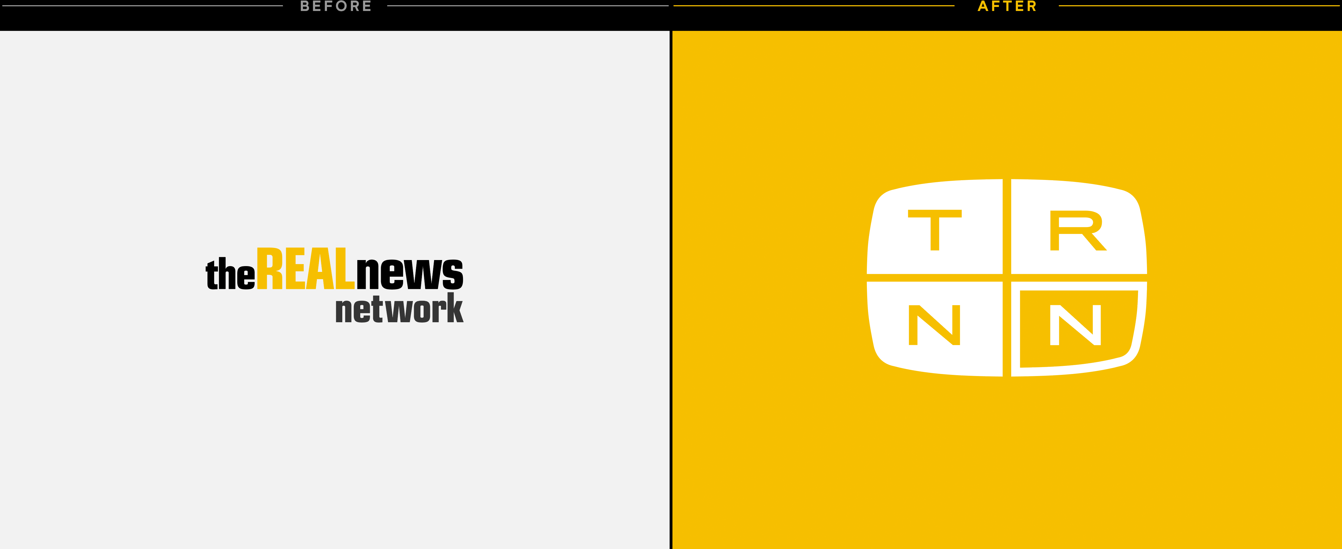
While it was known from the outset that certain traits of the brand needed to be preserved—colors, certainly, and a general sense of postwar modernity—everything else was up for reevaluation. We tore it down to the studs, and began with an in-depth series of meetings to identify what a modern-day TRNN was truly about, and to articulate its place in the contemporary media landscape.
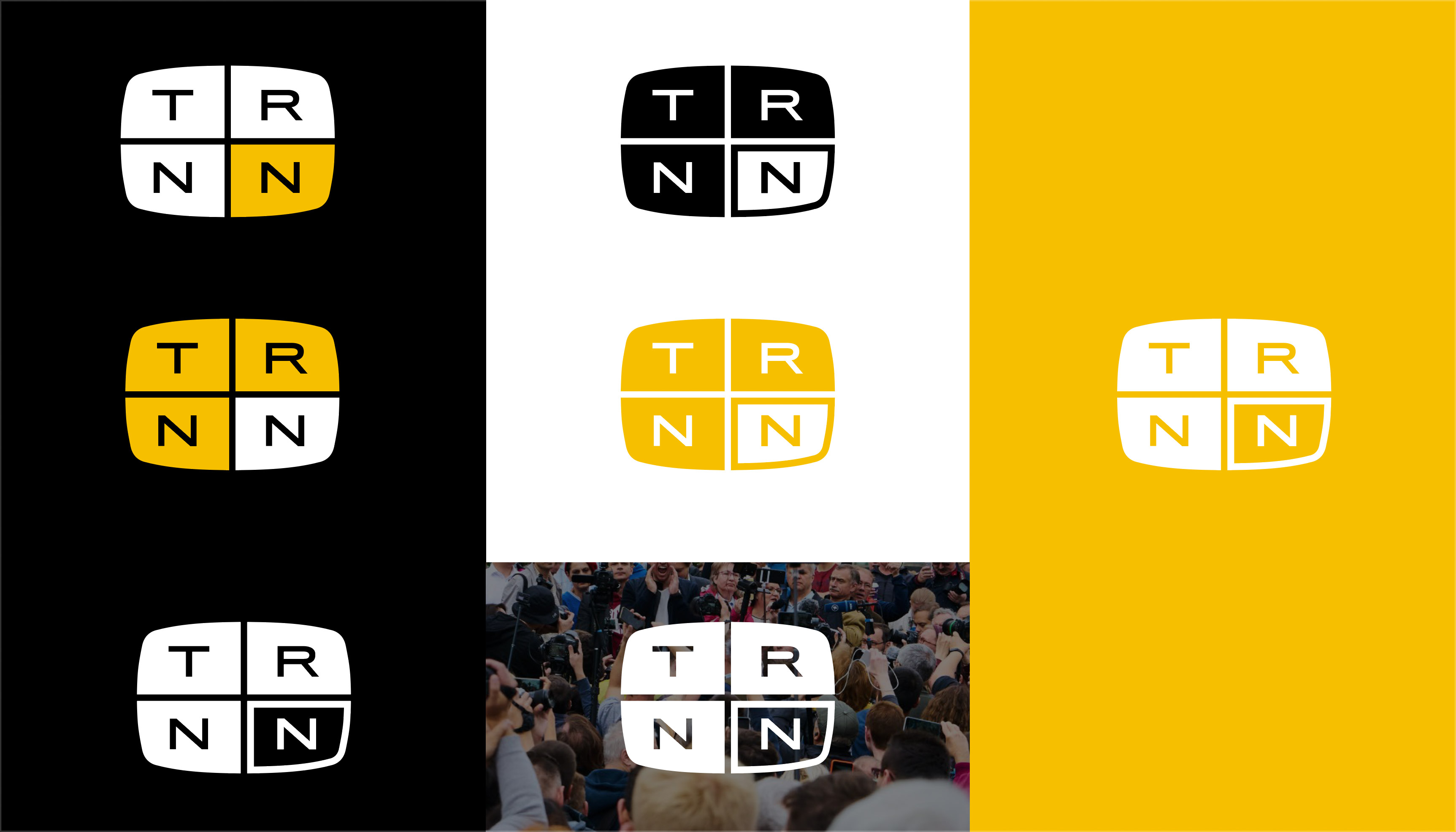
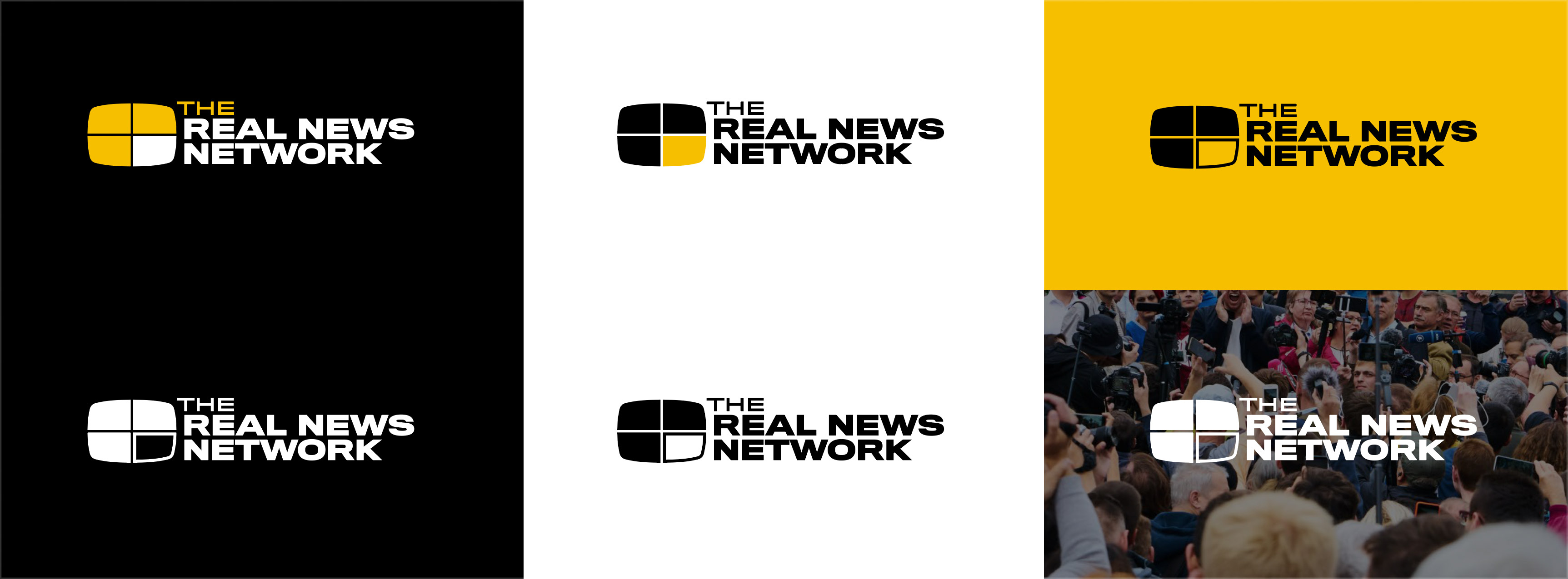
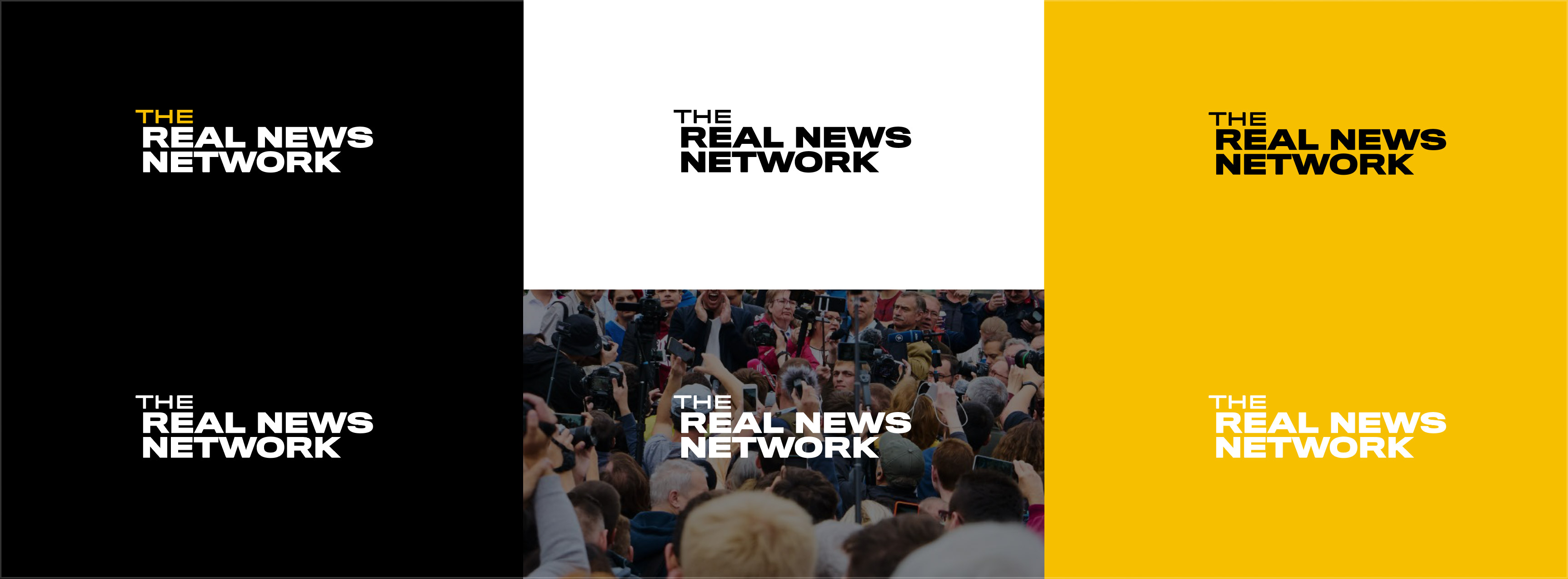
Placement and usage guidelines across each of the final mark’s canonical versions (logo, lockup, wordmark).
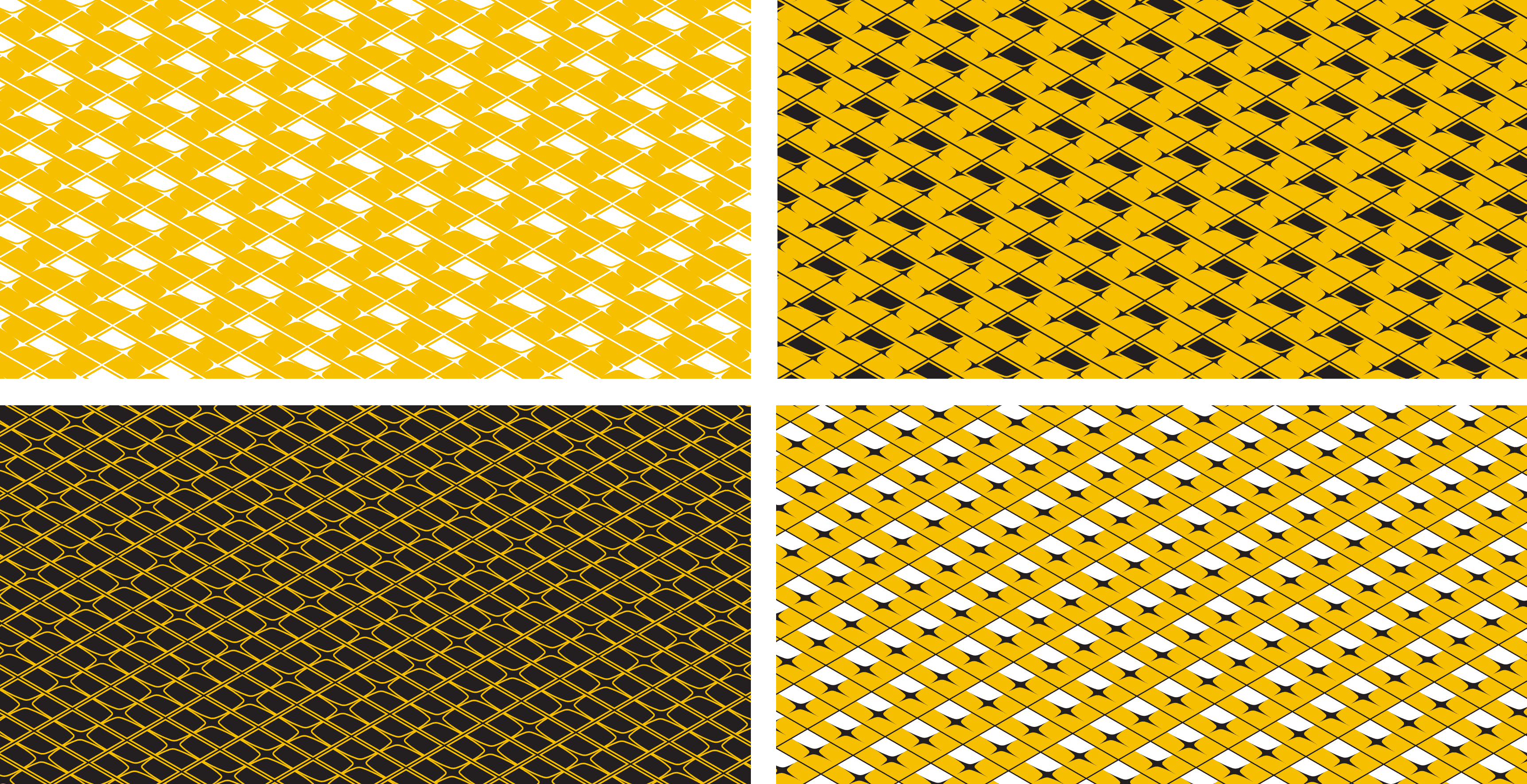
Included in my system were usable vector patterns, constructed from the logo itself, to be used in brand collateral (broadcast bumpers, print embosses, annual reports, and so on).
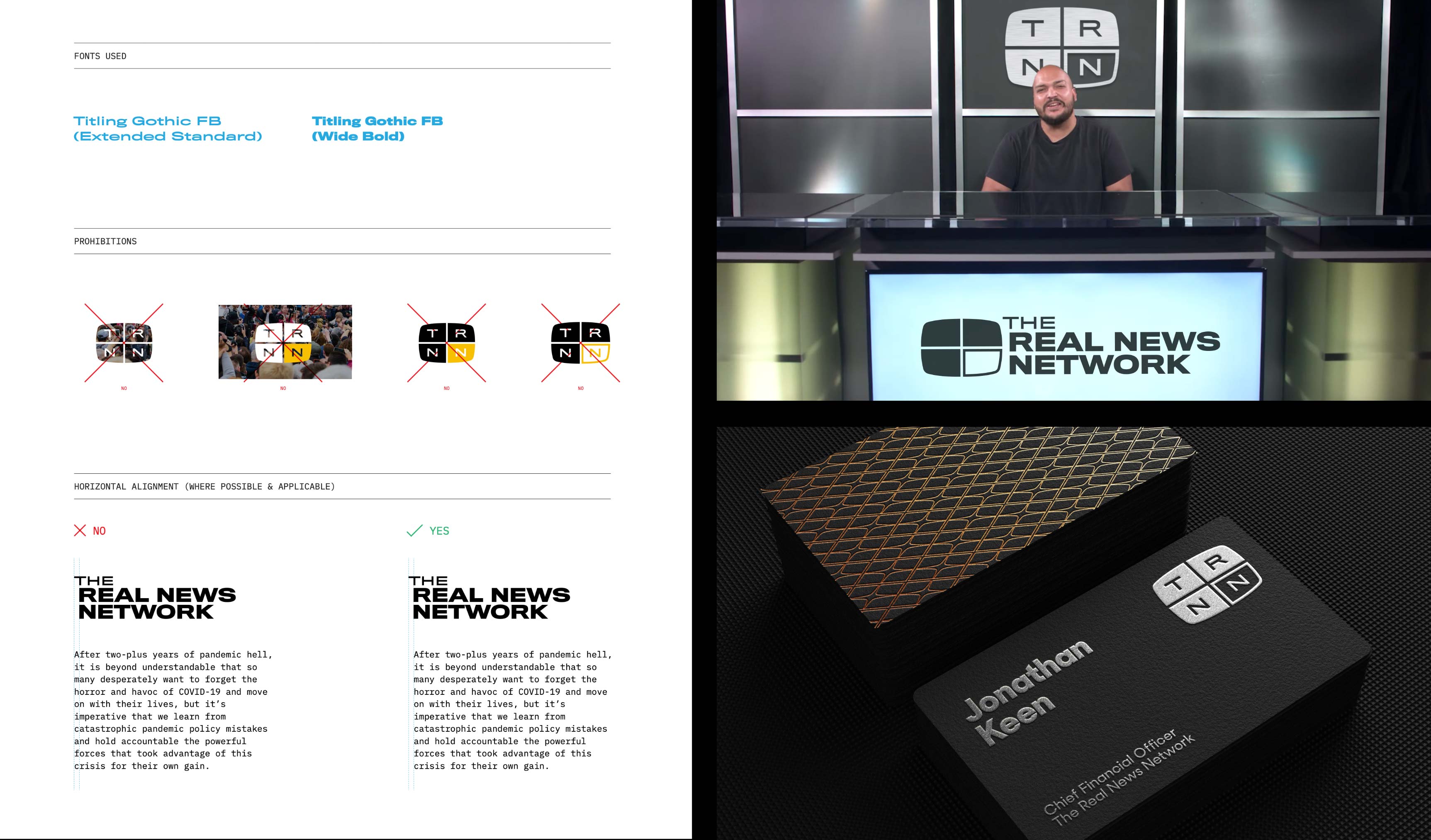
Guidelines and mockups.


Iterative rounds of early process, developed with regular incorporation of the client’s feedback.