The Roosevelt Institute
- Précis
-
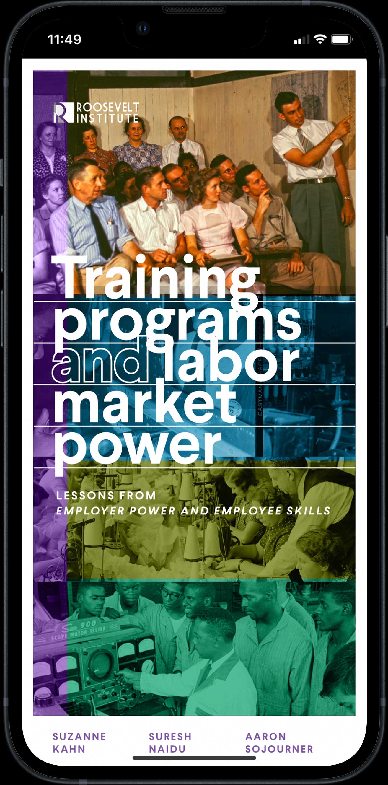
Does the conventional wisdom about skills training—that it necessarily boosts the working class’s earnings prospects—show up in the real world? The Roosevelt Institute, a widely-respected think tank in New York, decided to find out. I designed the microsite for their landmark report, and did so by marrying their brand colors & typography with the (actual) Roosevelt-era’s trove of public art.
- Services
-
Information architecture, visual design, front-end development.
- Link


I felt it important that the report’s graphs & visualizations were integrated with the storytelling of the text. JS and CSS work in concert to embellish those data.

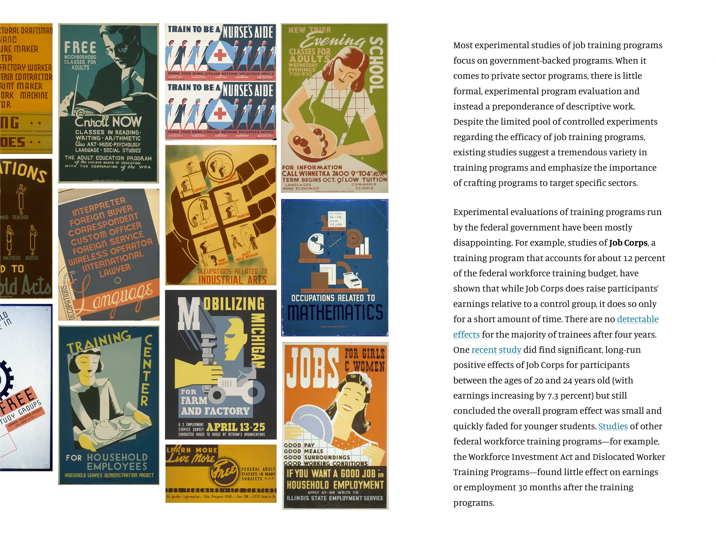
I mined the Library Of Congress’s and National Archives’s digital treasuries of photography to ground the reading experience.
Certain key themes reappear throughout the source text. I designed a system of using color coding to denote these themes, pulling the hues from the client’s own style guide.

Lush collages of public-domain imagery—from an earlier age of skills training—retain our reader’s attention.
This animated visualization did not exist in the source text. Instead, the manuscript described this phenomenon through static data tables. Out of a desire to make it as lucid as possible, I proposed a different—more explicitly narrative—approach, which the client blessed.