Microsoft Outlook
- Précis
-
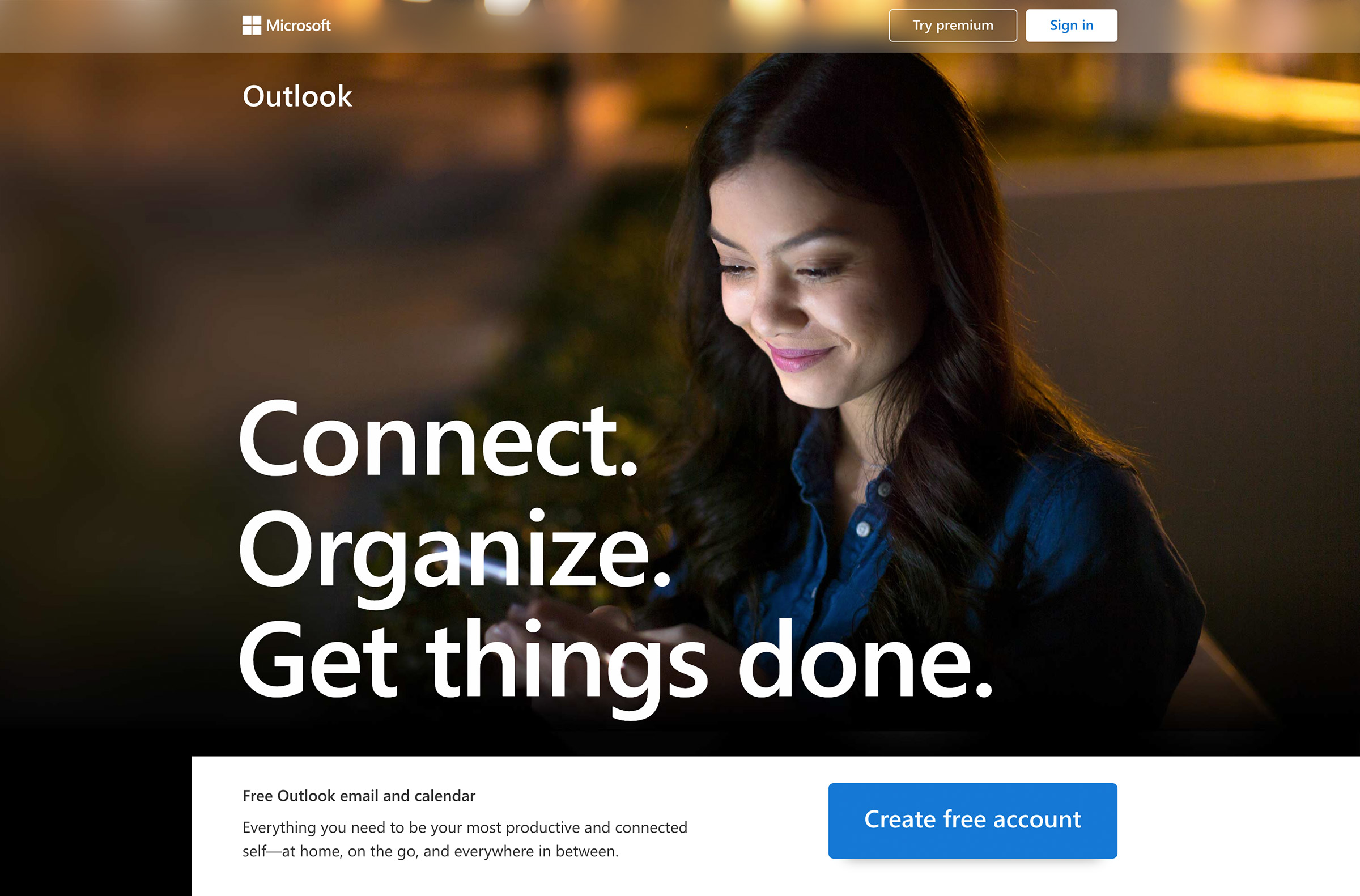
A quantum leap from the days of Hotmail, Outlook is today a globally-used, enterprise-grade, completely-free email & calendar platform. Further, its latest incarnation brings with it free access to Office’s productivity suite (Word, Excel, PowerPoint). What Outlook needed was a new way to tell that consumer story on its landing page, without compromising sign-in or mobile-download actions. I worked closely with Outlook’s research, brand, engineering, and PM teams to—in just two quarters—redesign, recode, and relaunch its new-for-2019 consumer landing page.
- Services
-
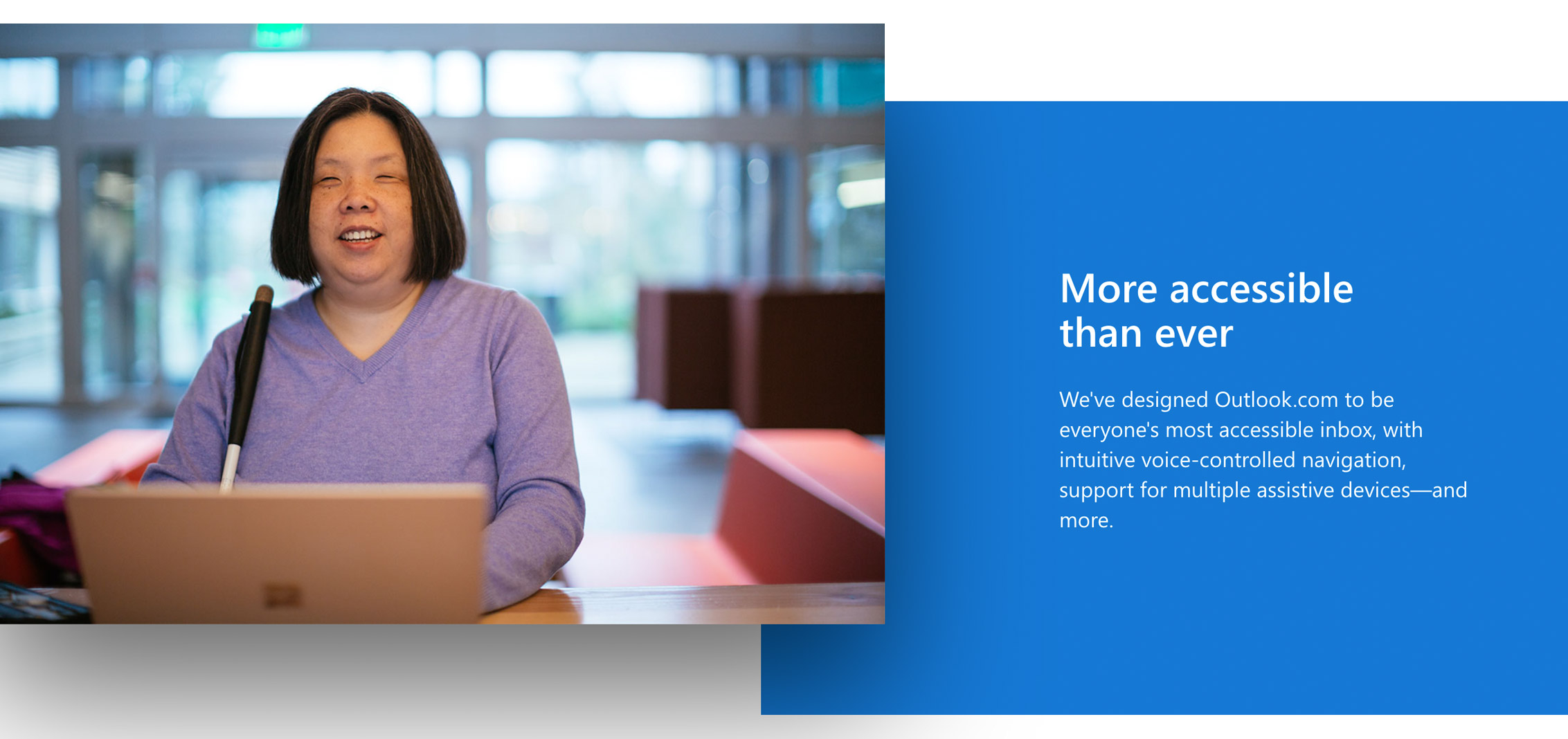
Information architecture, visual design, front-end development, screen-reader and accessibility engineering.
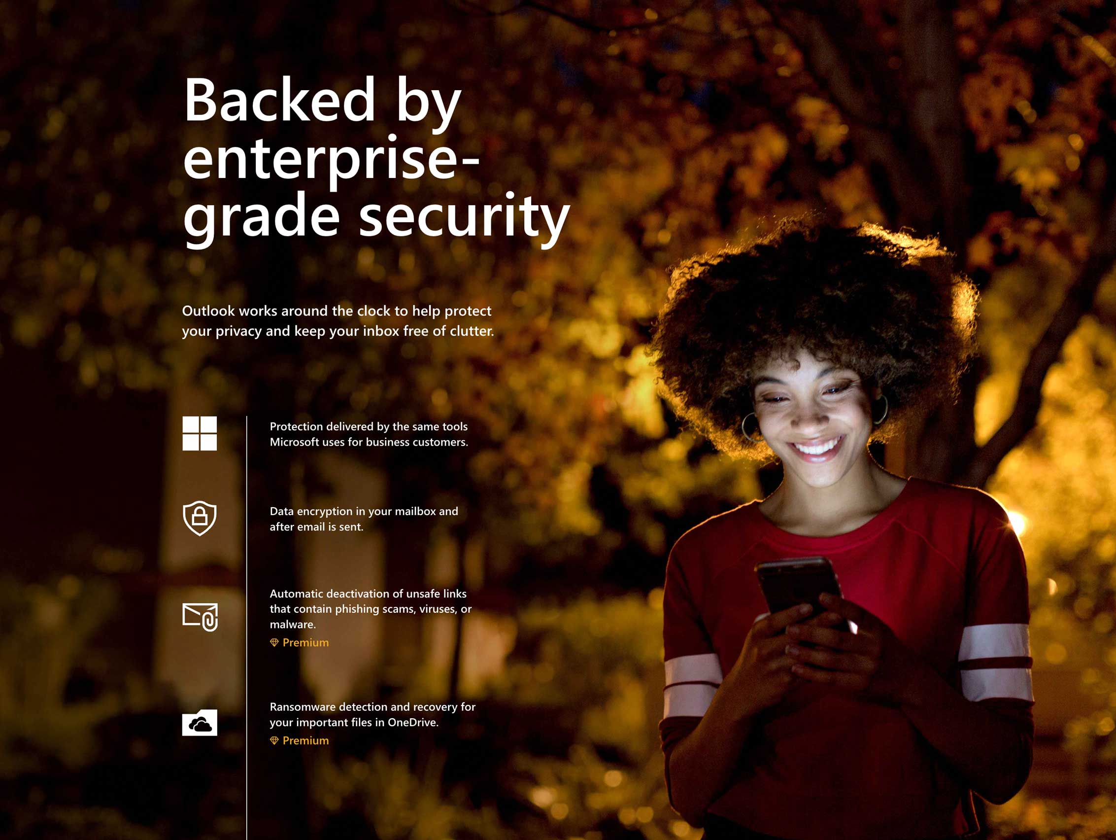
Using noncommittal interactivity to spotlight each of the Inbox’s multiple features.
I leveraged motion to convey the surprising-to-most revelation that (free) Outlook included (free) access to the Office suite.
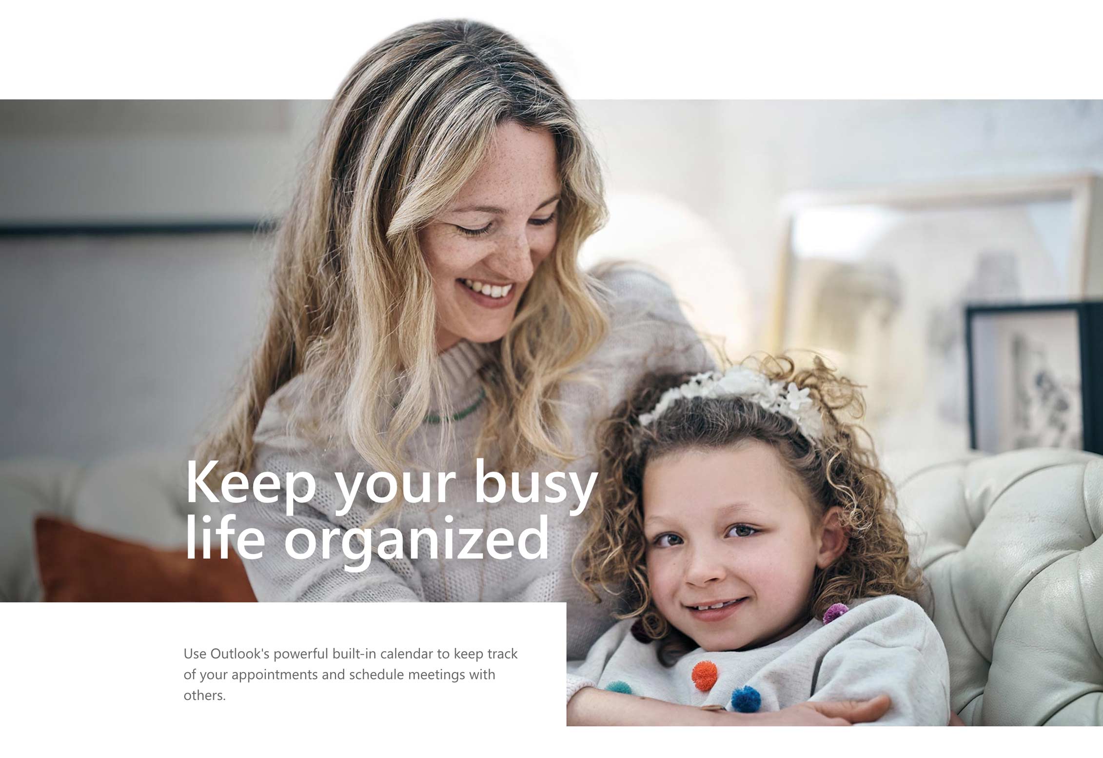
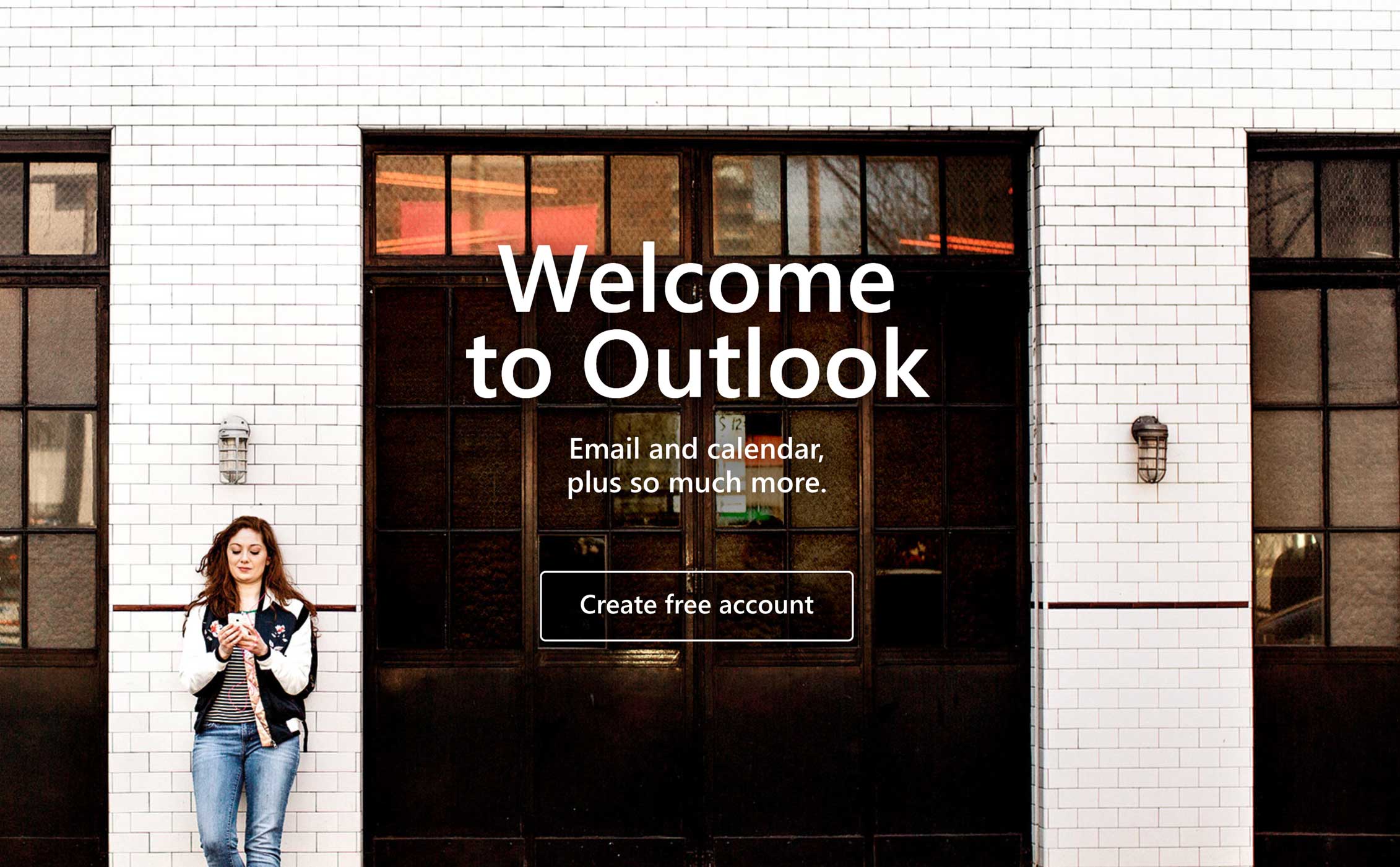
Although the trend at the time—particularly for the genre of single-long-scroll SaaS-marketing sites—was steeped toward amorphous illustrations, I advocated for tapping Microsoft’s catalog of (legitimately beautiful) photography. To interact with one’s inbox is an inextricably human activity, and one that I wanted to celebrate.
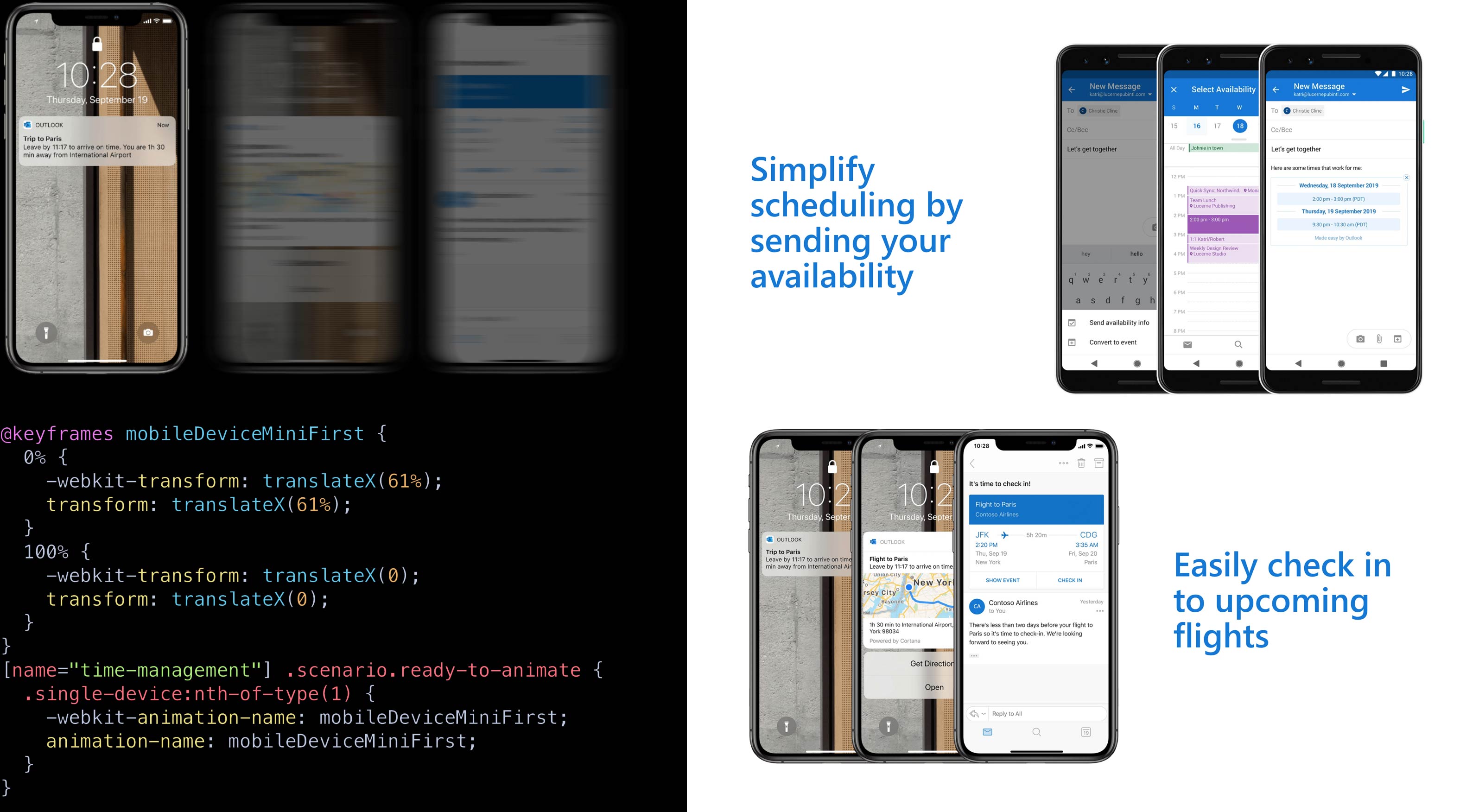
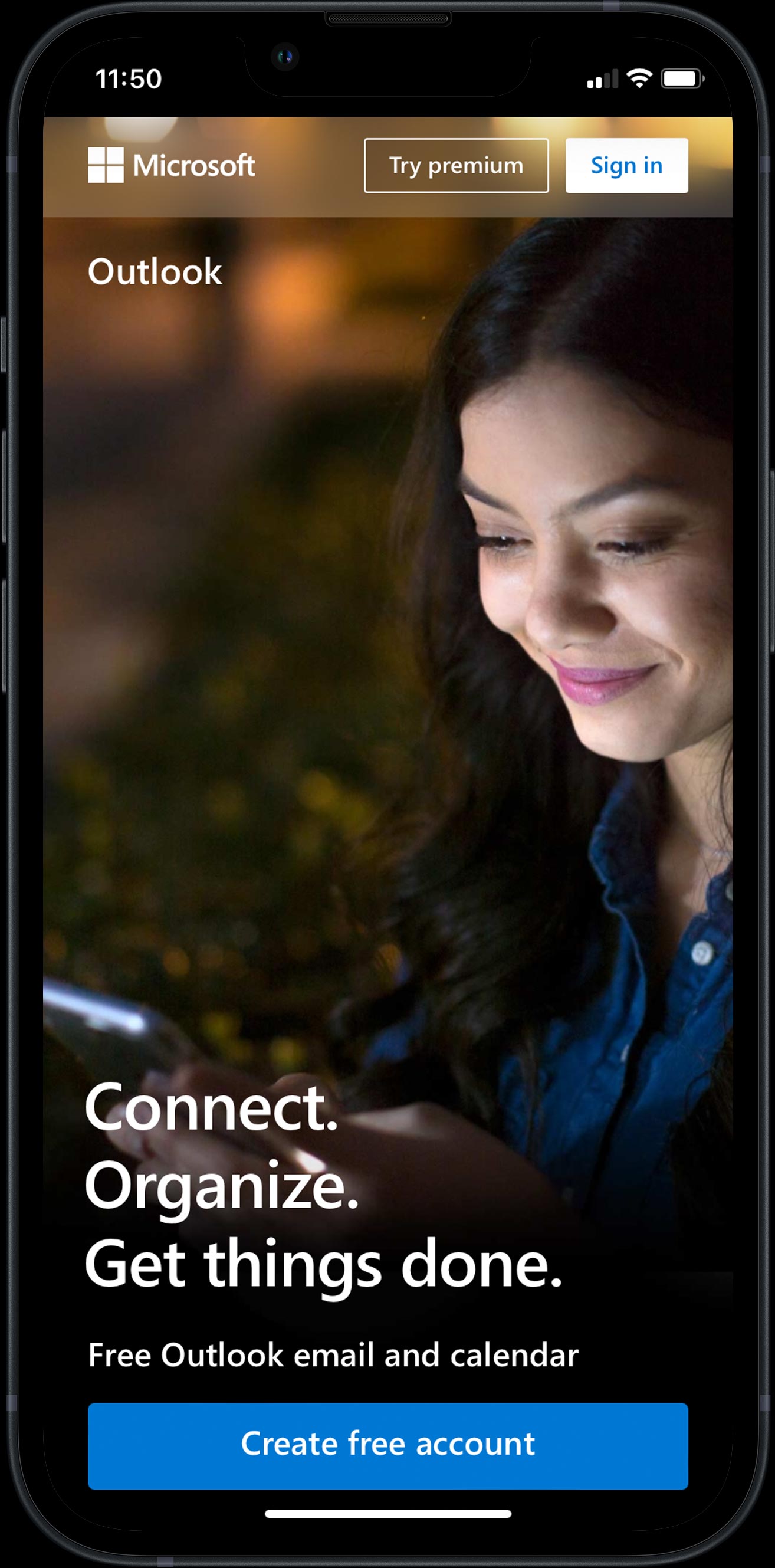
I used animation again for a subtler business case: showing, rather than telling, that Outlook sports world-class, completely free, enterprise-grade native apps for iOS and Android.
Together, we arrived at the solution of merging this appeal with that of Outlook’s intelligence features—specifically, those most related to the dynamism of being out-and-about with your phone.
I scripted the phones to dynamically fan out as soon as they enter the viewport, granting a little mental enticement to keep scrolling.
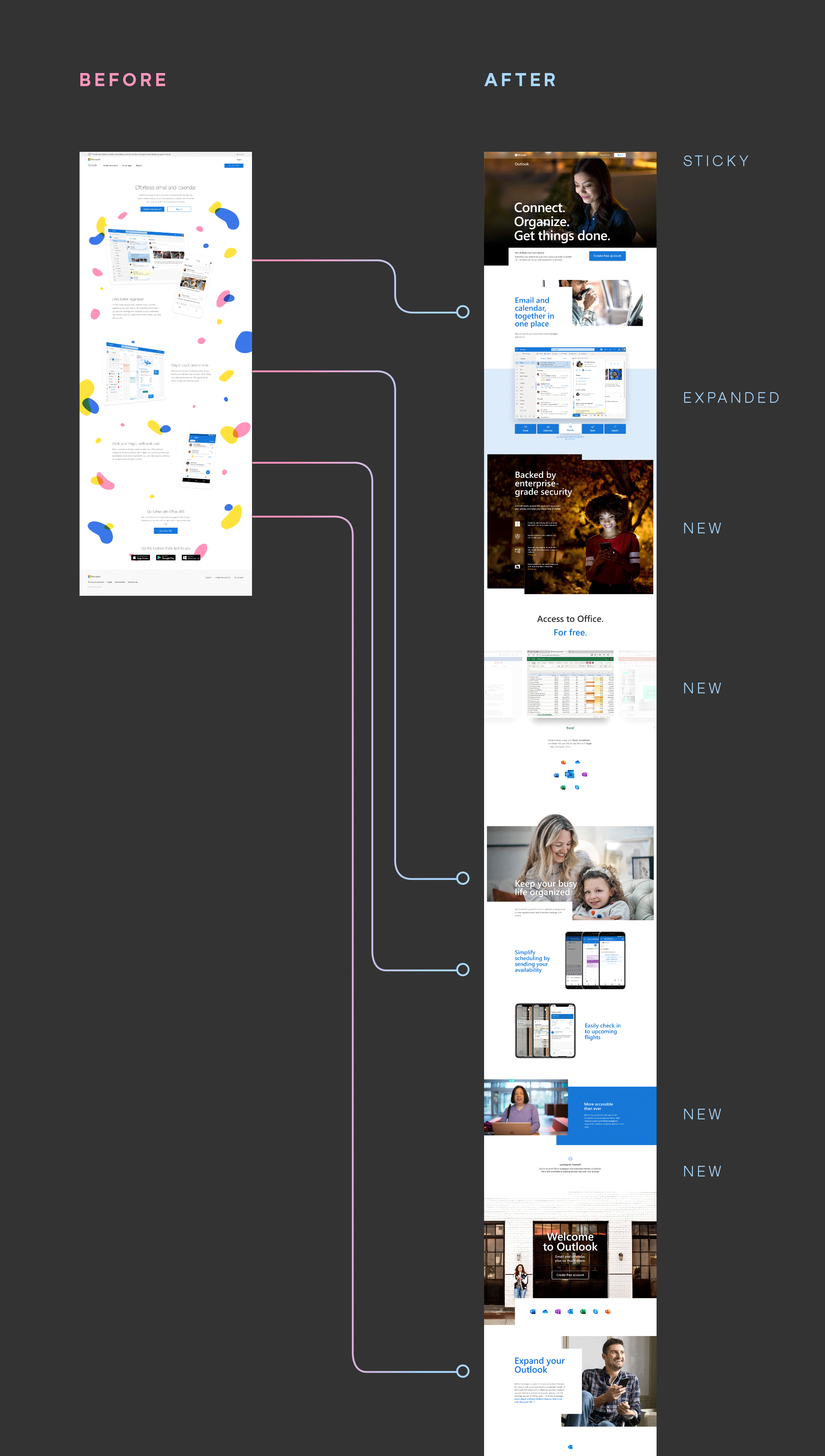
My favorite part of any redesign effort is its first one: working with a client to unpack what their material goals are. In the case of Outlook, the new site needed to retain some, transform some, and invent whole new appeals.