Current Affairs
- Précis
-
The rabble-rousing culture-/politics-criticism periodical Current Affairs continues to not only stay alive in a culture of shrinking magazine subscriptions, but remains beautiful, discussed, and lively. The only problem lay in the disconnect between its lovingly-designed print edition and its just-good-enough web edition. Editor-in-chief Nathan Robinson—who shares my affection for Victorian print ephemera—reached out to ask if I’d be interested in bridging that divide. After carefully absorbing everything Nathan-and-team wished for in a redesign, I set about recasting its views to exhibit the elegance, whimsy, and sophistication of its print sibling.
- Services
-
Information architecture, visual design, front-end development.
- Link
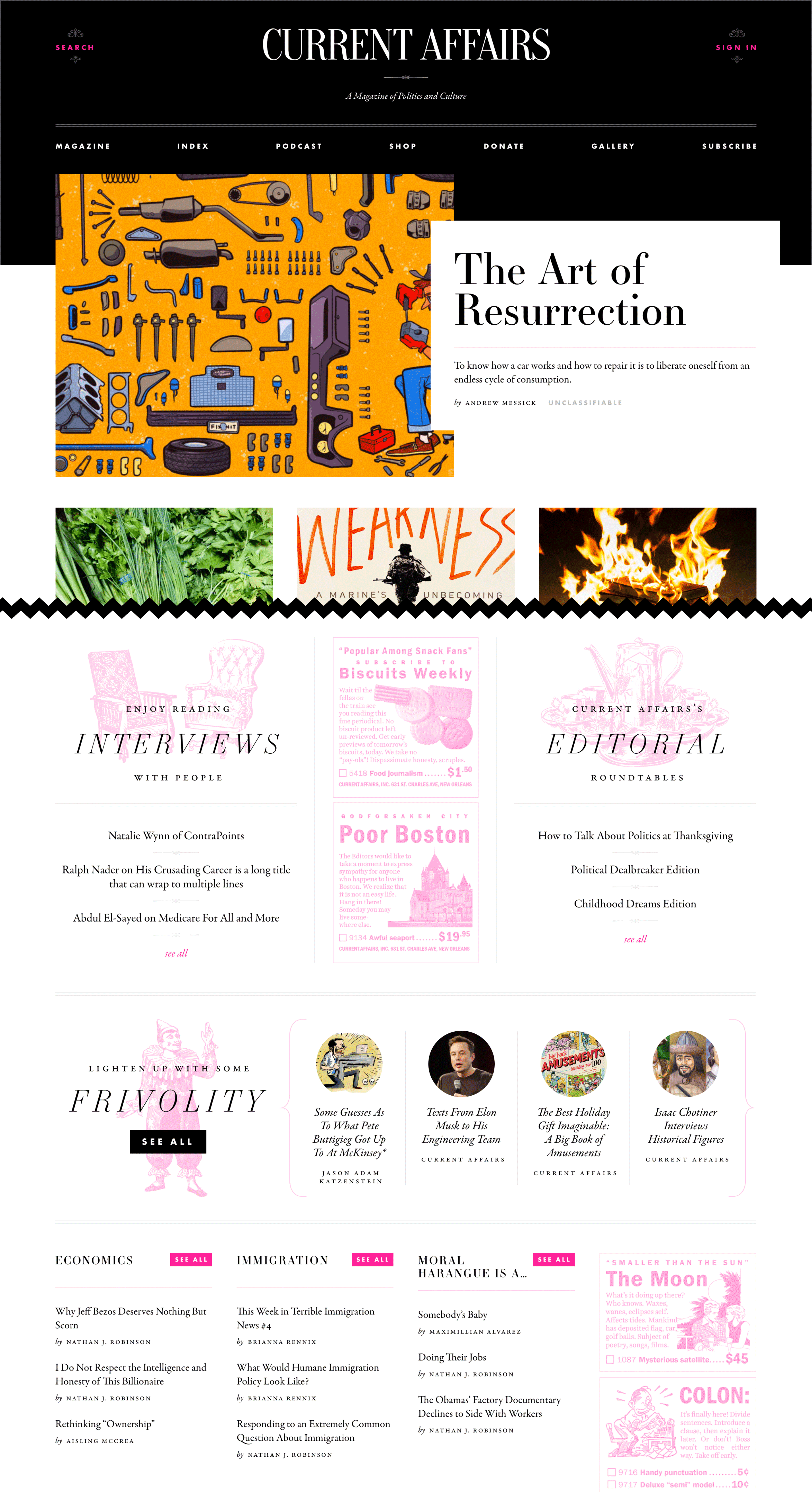
The home page is a fusion of both the unpredictable (editorially-picked article thumbnails) and the planned (Victorian-woodcut nonsense).
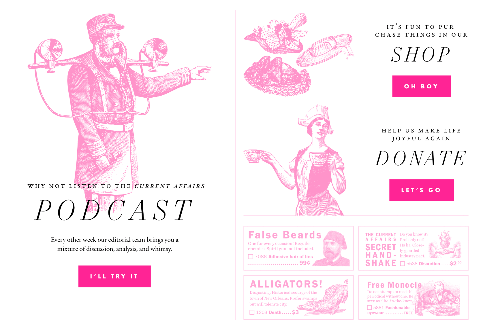
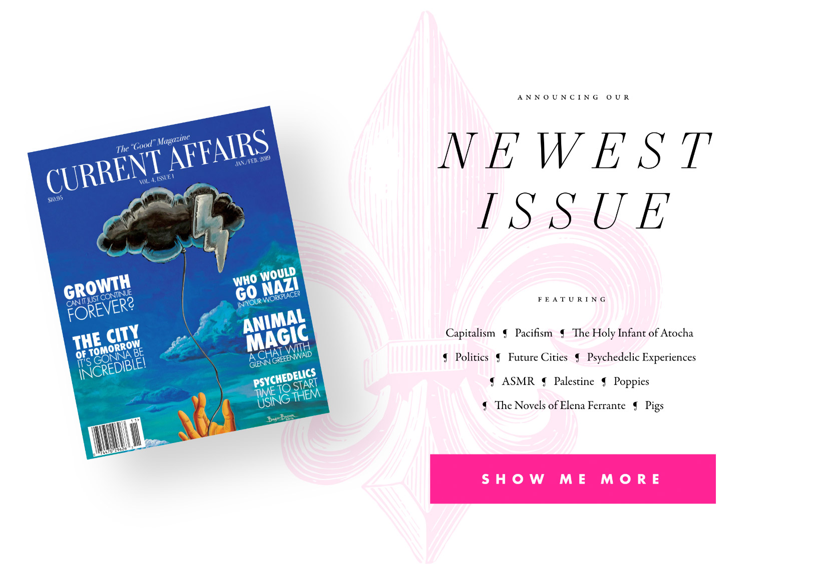
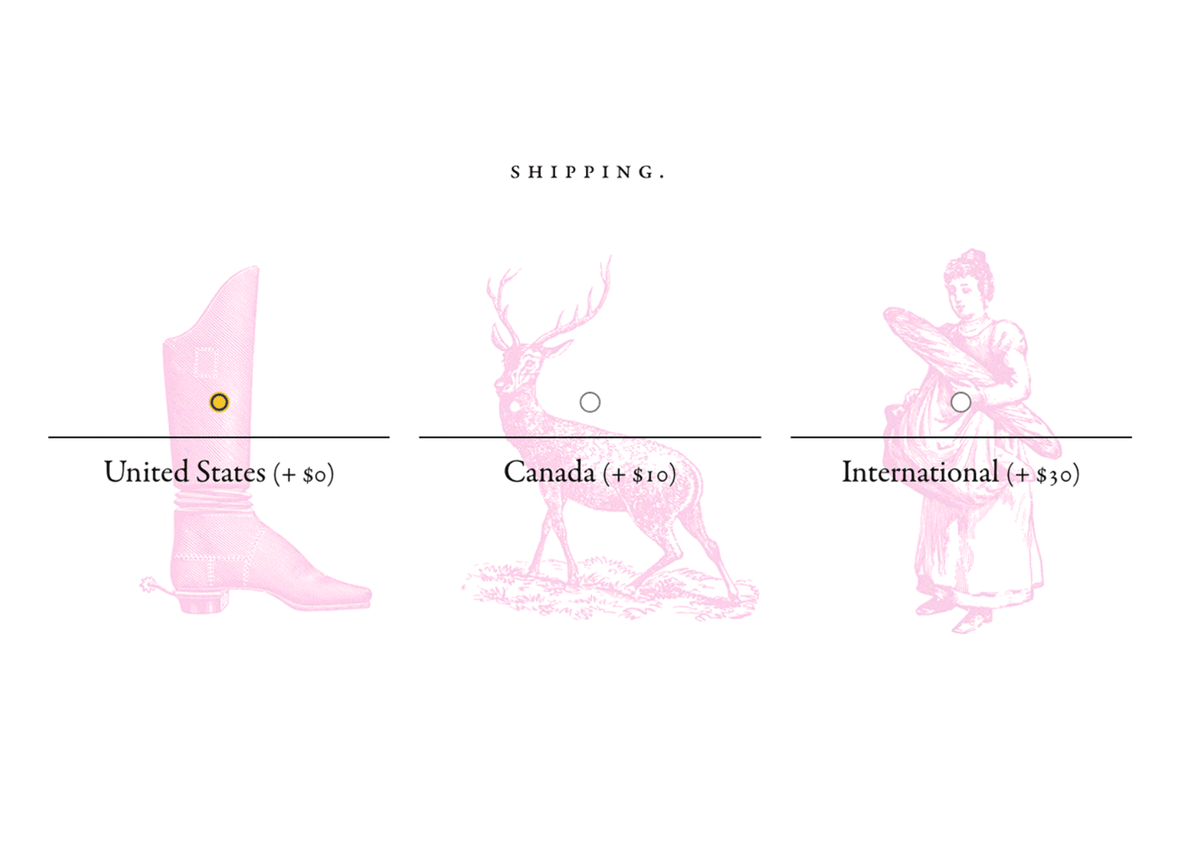
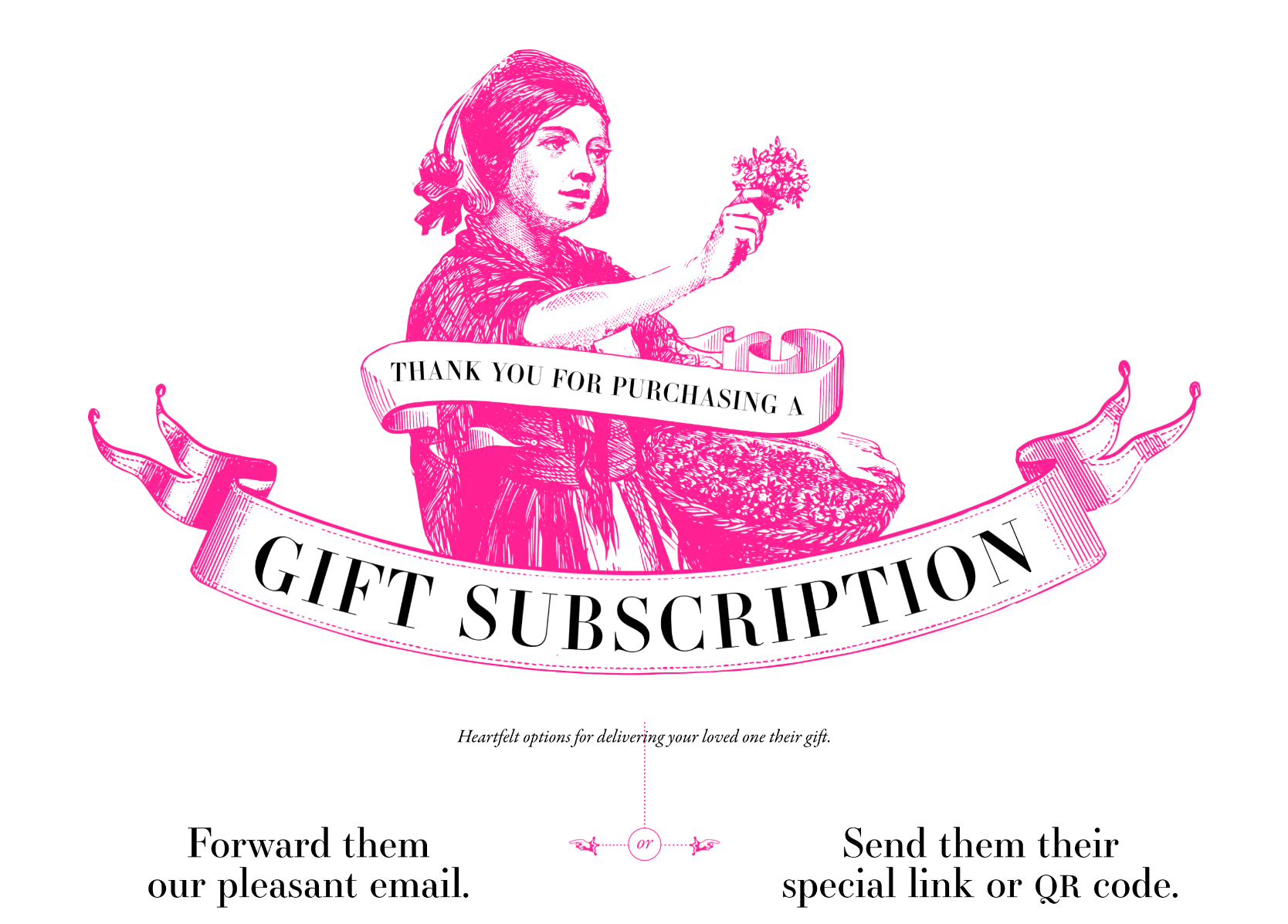
CA’s penchant for subliminal gags runs through my own DNA. I made it my personal mission to fill any corner that could contain frivolity with frivolity.
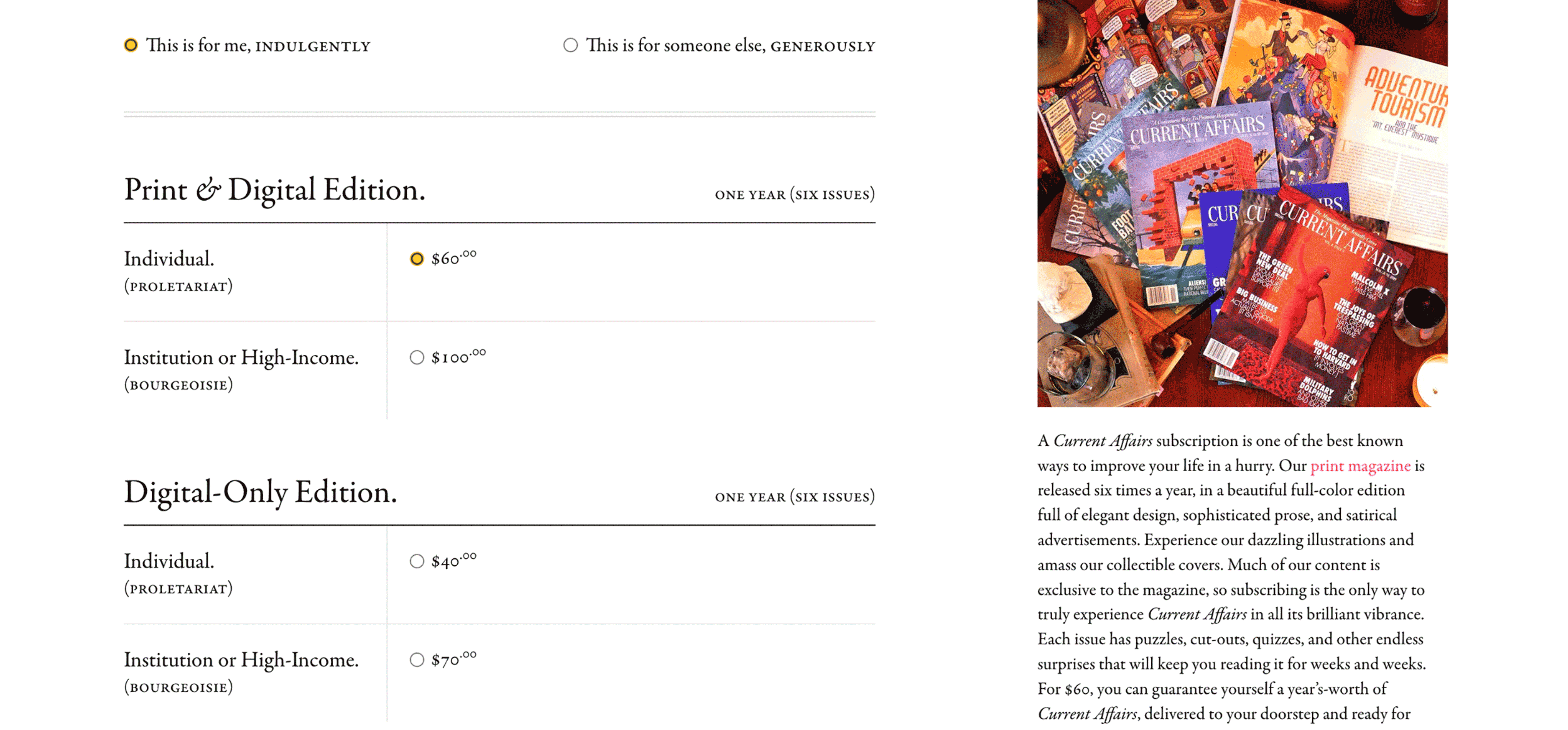
The print-edition subscription appeal justified its own longscroll marketing page. These kinds of scroll-triggered reward animations keep the appeal from feeling like an appeal.
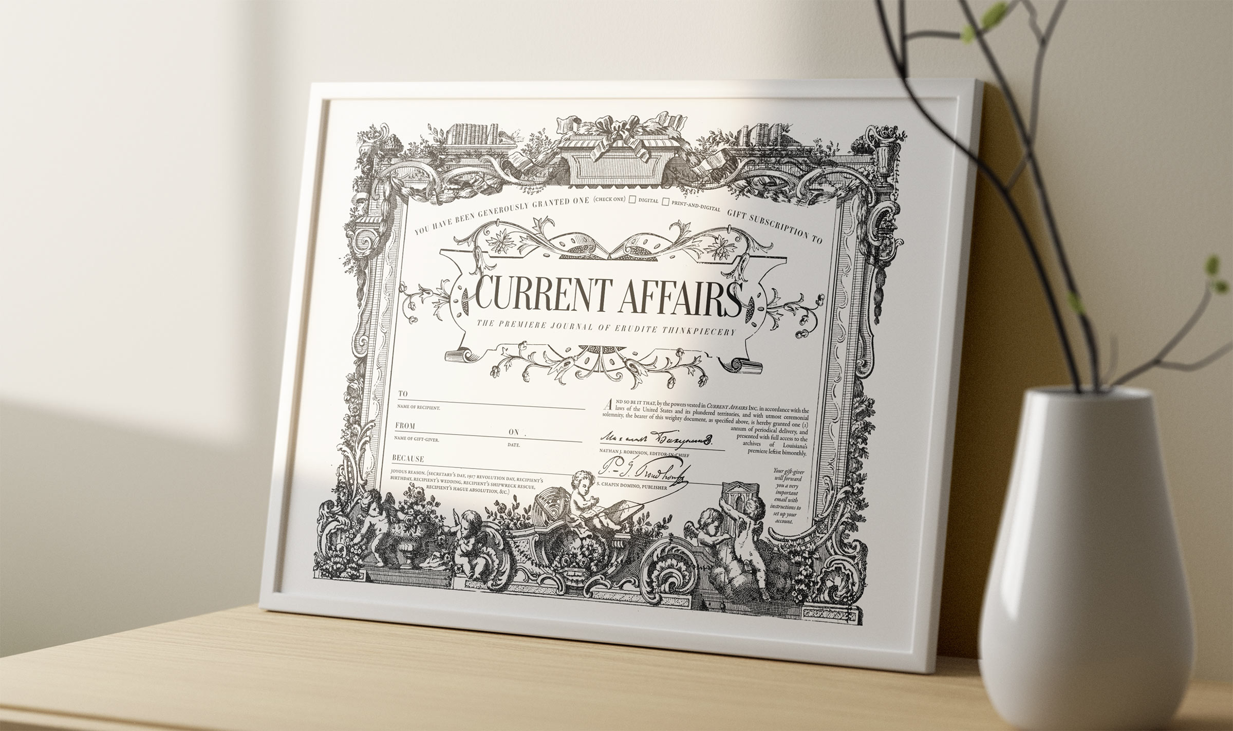
Gifting a loved one their own print subscription merits a printable gift commemoration, which I designed to be as insufferable as possible.
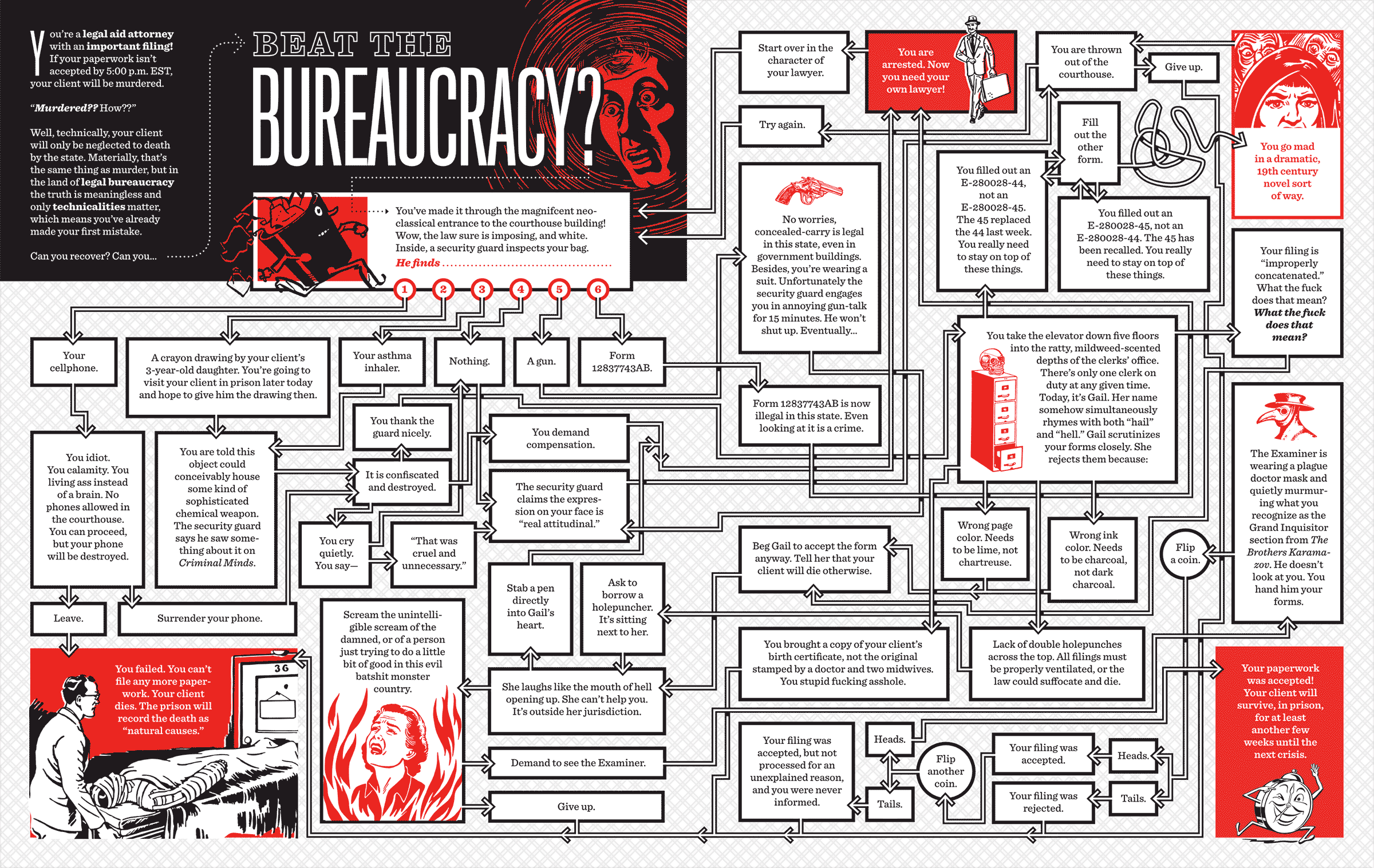
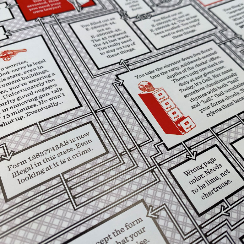
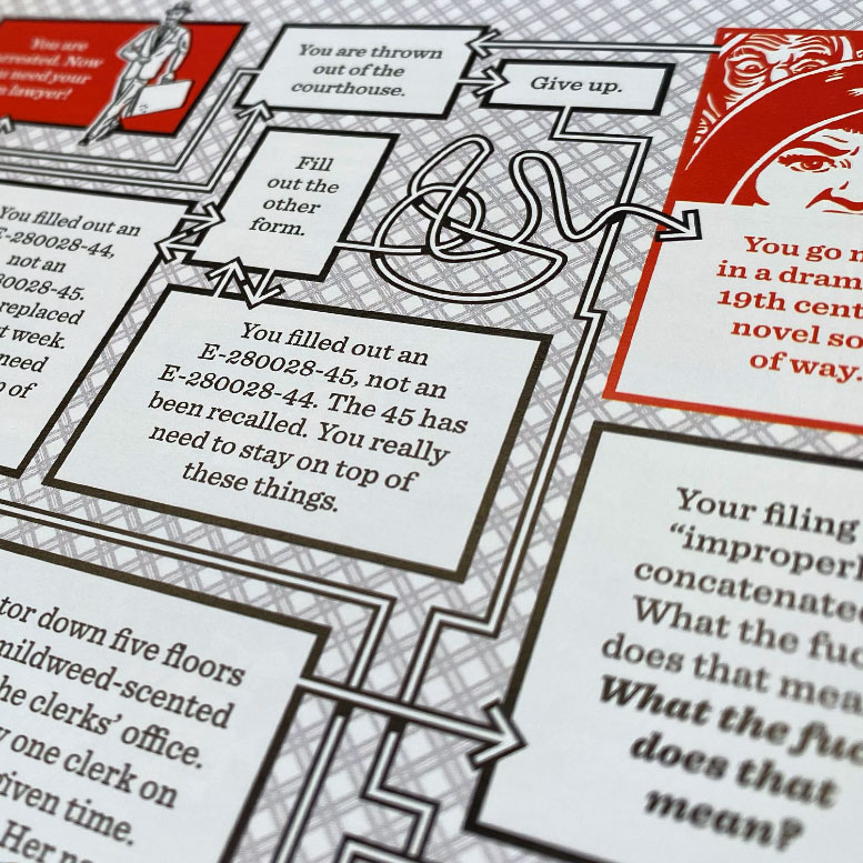
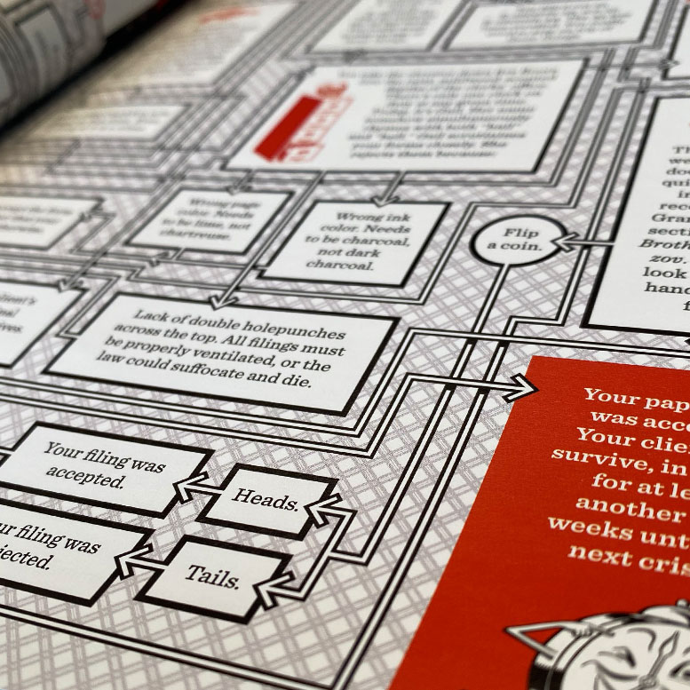
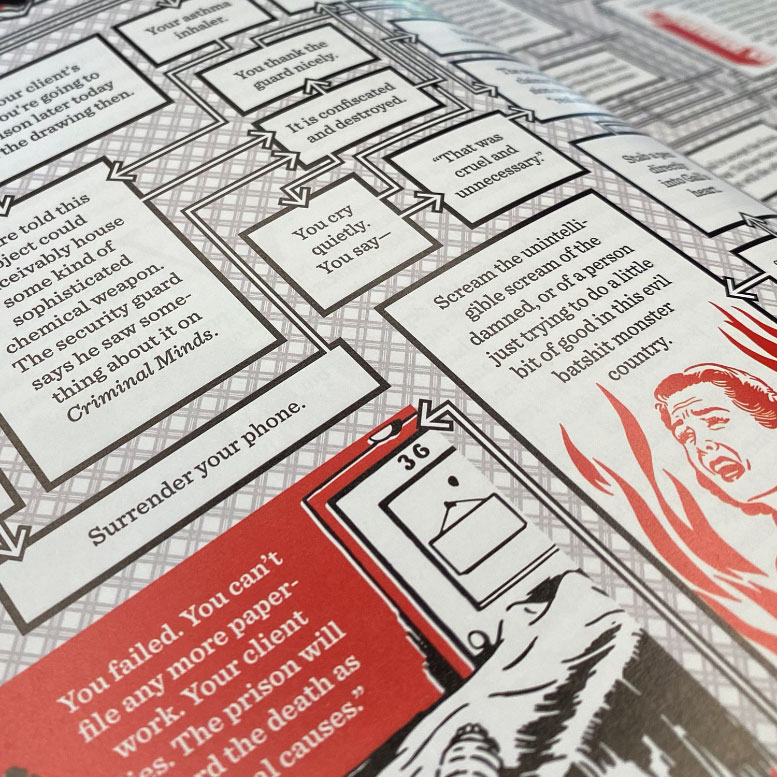
In addition to my digital work, I’ve also contributed some pieces to CA’s print edition. My favorite of these is this sprawling bureaucratic choose-your-own-adventure flowchart.